New Charts
We’ve just finished replacing the charts. The new charts function the same as old ones, but rely on a different charting API.
There are some advantages to the new charts, and there should be no disadvantages. The advantages are:
- Since the new charts rely on Java Script and not Flash technology, they are much more portable. Flash is not supported in Apple devices for example. We had some solution for that even with the old charts, but now it is the same technology that runs on all platforms which makes it function more consistent, no matter what you’re using to view our website.
- Flash needed installation, and users without flash installed were requested to install it. Now, this is no longer an issue. JavaScript is part of all browsers.
- The old charts couldn’t stretch, so the size was fixed even if you needed it change. Now, the new charts adapt to your screen.
- The new charts allow more export formats. Not just PDF, now you can also export the charts to SVG, PNG and JPG formats (images formats).
Few notes:
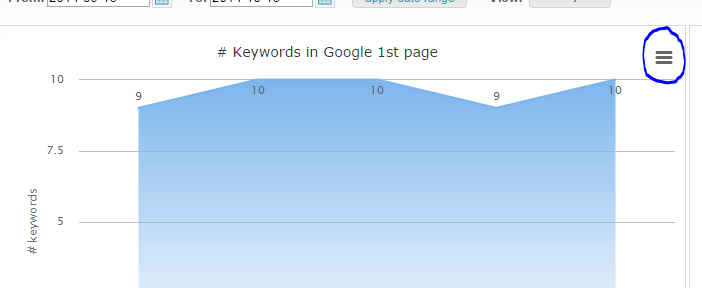
1. The export now usually works from a button in the upper left side of the chart. See here:

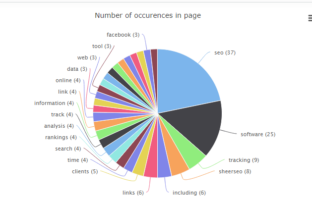
2. The density lists are now pie charts (instead of bar charts). But the data is the same as before. Just different presentation. For example:

Subscribe
0 Comments

