Responsive UI
We’ve worked hard to keep adjusting our interface to be mobile friendly, or in other words “responsive”.
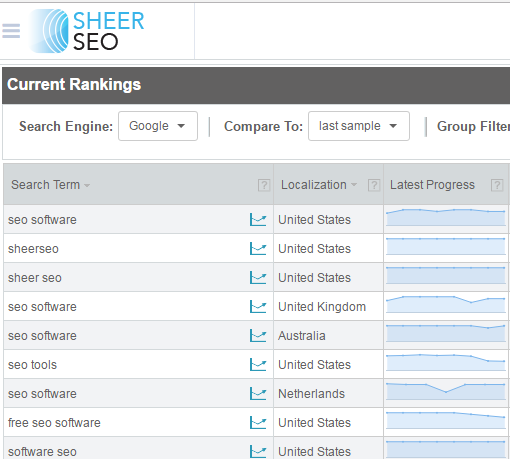
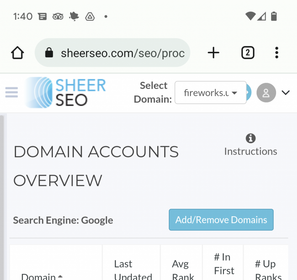
You’ll notice that we changed our application side menu, so it is hidden when seen on small screens by default. You can use the hamburger menu next to our logo to show/hide the menu.
See here (menu hidden):

Notice also that the logo was reduced to 160px width and 80px height. This is now the ideal logo size. If you use an agency package, I suggest that you find a logo that is around this size. Otherwise, the application will do the best to fit the logo into these sizes, but it might look a little squeezed.
Subscribe
0 Comments

