New User Interface!!!
It has been a while since we launched something and users start asking why we didn’t load any new features. The reason was that we were working on a few bigger improvements and those take long time to develop. One of those new improvements is a new UI (user interface).
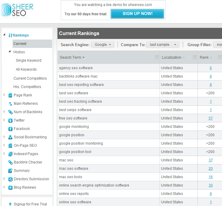
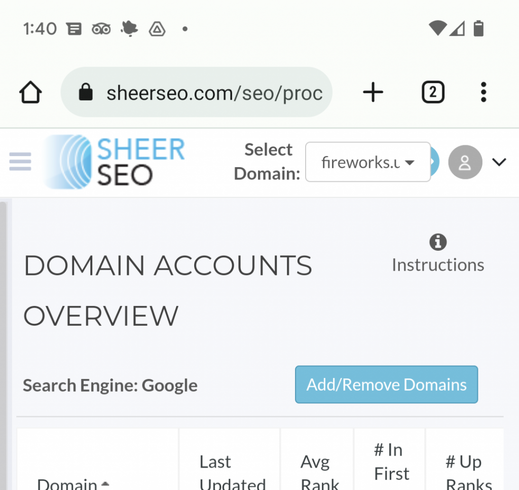
Here is how it looks like:
Let me walk through the major changes done in this new UI:
1. Simply looks better and cleaner! – The old interface was designed before the site actually launched and many things were added as we grew, but there wasn’t any graphic designer involved, so things got a little messy as code developers do stuff.
2. The navigation changed from screens>tabs to dynamic tree. The advantages are that you can now open the branches in the tree that you are focusing on without seeing so many screens open in the menu. Also, with the tabs you had to first open the initial tab set for that screen, wait for it to come, and only then go to the tab you actually interested in. This is now avoided. You just open the branch, for example settings, and from there choose the actual screen you want to open, say “groups” page.
3. We open (at least in most cases), only the part of the screen that changes, instead of refreshing the entire screen. This makes navigation faster, and cooler.
Still working on some fixes/improvements for the UI, but hopefully, you already find it useful. Feel free to express your feelings about it, even if you are one of those who simply hate changes.


I like this new interface, much cleaner than the old one, excellent SheerSEO!
Love Sheerseo – Best SEO tracking by far!
R