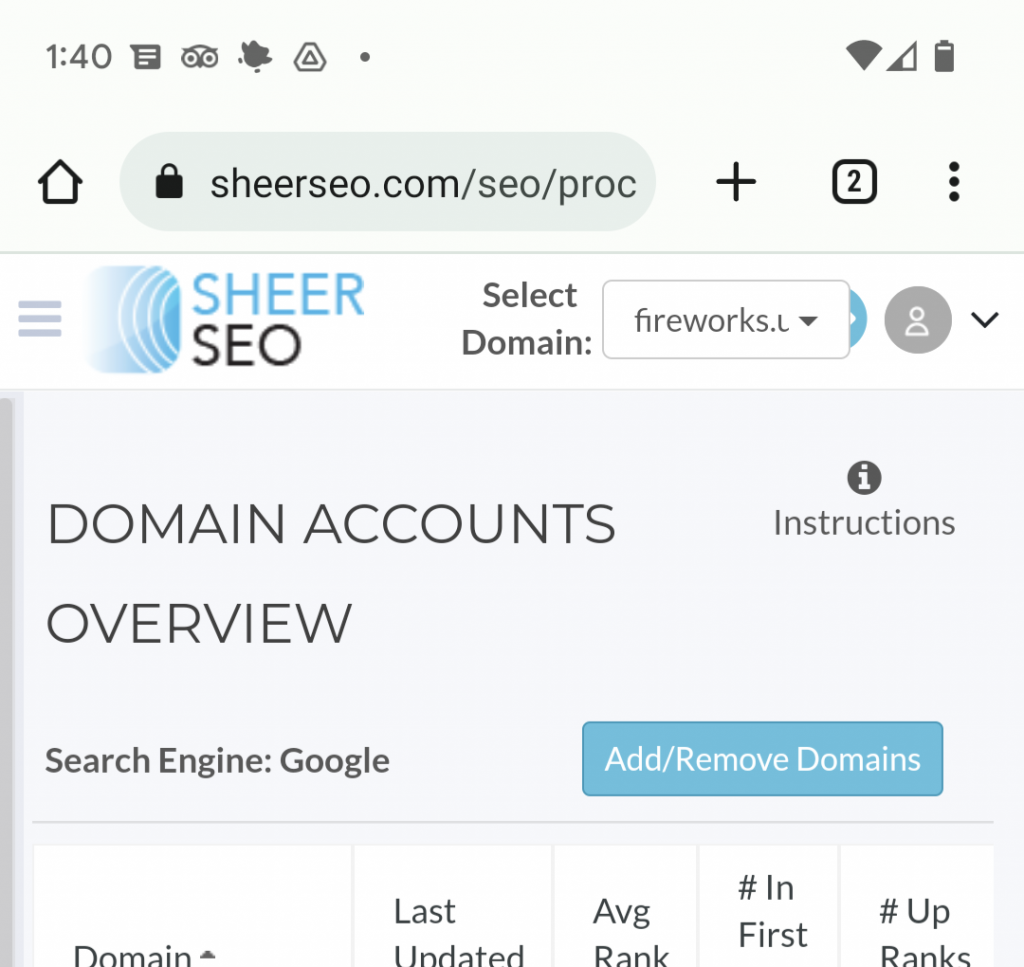
UI Changes – User Panel & New Menu
Just launched a few UI updates, which should make the UI much cooler and help your experience with SheerSEO.
User Panel
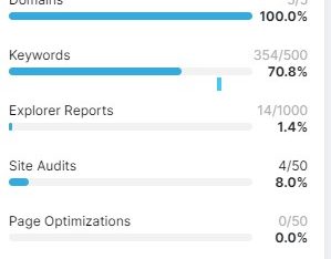
The user panel shows your current monthly usage and helps with navigation.
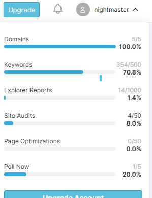
The top part of the user panel shows you how much of your resources are used/available, so you can plan your usage and avoid depletion of any of your account’s resources.
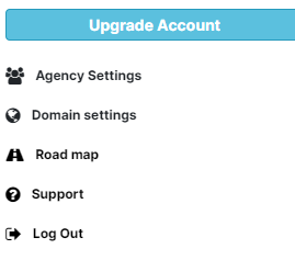
Second part of the panel is some navigation links. Mostly for settings purposes
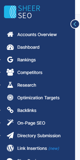
New Left Menu
The new menu is much like the old one, but much cooler 😁
Hope you like it
Subscribe
0 Comments

